How to Custom Style GiveWP Features
So you already know how to add custom styles to your WordPress site, and why that’s important. Now, how do you style GiveWP-specific elements? This document will walk you through how to style GiveWP elements in a way that doesn’t affect elements on the rest of the site.
Using Developer tools to find GiveWP-specific elements to Style
To customize GiveWP with your own CSS, it’s necessary to identify the IDs, classes, and HTML tags used by it to create your custom code. The easiest way to do so is by having a website running GiveWP and pages with content, like donation forms, donation history page, subscription management page, the donor dashboard, and others.
Using the Inspector tool on your web browser
Everything on a webpage is considered an element. The button you click, the image you see, the text you read, all of that are elements in your page. You can inspect them using your own browser, like Google Chrome, Mozilla Firefox, or Apple’s Safari browser.
When you inspect the element, you’ll see all the styles and rules applied to the website elements. This is the perfect way to test visual changes before applying them to your site for real.
To use the inspect element feature of your browser, right-click anywhere on the page, select “Inspect Element” or simply “Inspect” depending on your browser. The examples here are using Chrome. Any chromium-based browser will be the same, and the others have similar features.
That opens the Developer Tools panel displaying the Elements tab on the bottom of the browser window. To give the browser more visible room, click on the three dots next to the close X and then select Dock to Right.
The Elements tab of the Developer Tools panel allows you to see all of the HTML elements and the styles applied to them to create the website. From there, you can add styles that affect only your browser so it’s essentially a playground to try out and learn how to apply styles without messing up the site for other visitors.
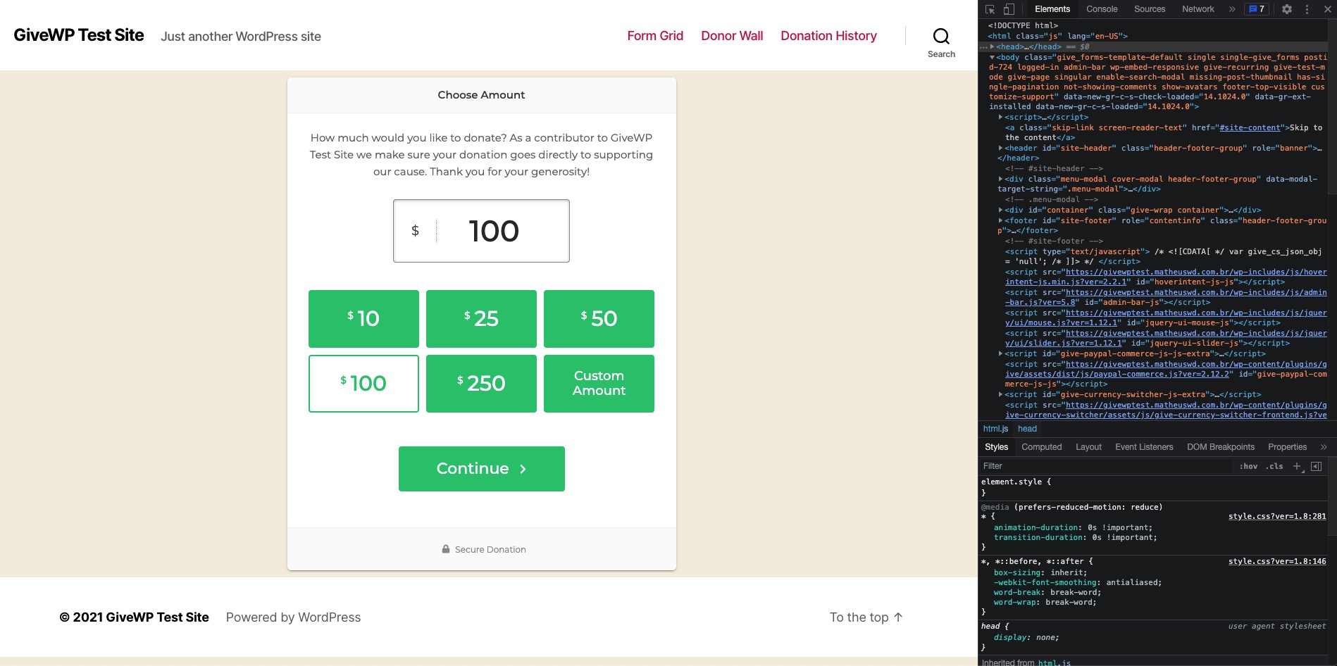
One of the most useful tools that you can use is the selector, allowing you to select any item on your page to see it in the Elements tab. The selector is the first icon on the Developer Tools panel:
Once selected, the selector tool will highlight the element that you are hovering over. Click on the element that you want to style, like a donation button, the text of a donation form, or the payment gateway. The left part of the Developers Tools panel will show the HTML of that specific element that you clicked to select (in context of all the elements before and after it) and on the right side of the Developers Tools panel, you’ll see any styles currently applied to that element.
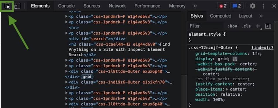
This right-hand column is where you’ll add your custom styles using CSS, and they’ll only apply to your browser, until you reload.
To add CSS to the currently-selected element, click on the plus sign in that column and you’ll be able to add your own CSS, using the class, ID, or HTML tag of the element you selected – it can be a mix of them.
Using that plus sign, add your own CSS to the element that you want to change and it will be applied instantly. Once you get the styles configured for each element you want to modify, copy your new styles and add them to your site. You can read more about how to add it by reading the documentation for adding custom CSS.
The way GiveWP adds classes and IDs to differentiate between forms/elements
Elements created specifically for GiveWP are designed to work alongside the vast majority of themes and plugins available for the WordPress ecosystem. To that end, each element can be isolated and styled separately from other elements.
Take this common example: any of the popular form builder plugins create input fields such as text fields, text areas, dropdowns (called “select” fields in HTML) and “Submit” buttons. If you create a style from all input fields on the site, and don’t clarify that you intend to only style GiveWP inputs, your styles will be applied to (and potentially conflict with) those form builder inputs.
The GiveWP – Donation Plugin will always use the give class for its elements, and then add more classes and IDs if needed, all of them starting with give-. For example, a button will be called give-btn, while an input will use the give-input class.
For the add-ons, all of them start with give. See some examples below:
- GiveWP Recurring Donations: give-recurring
- GiveWP Stripe Premium: give-stripe
- GiveWP Gift Aid: give-gift-aid
And each part of the HTML created by the add-ons will also start with their respective slug.
Understanding Specificity to Only Target GiveWP Elements
Cascading Style Sheets (CSS) is the means by which browsers apply styles to site elements.
CSS specificity is the means by which the browser decides what is the most relevant CSS instruction (code) that will be applied to the page. It’s a weight that is applied to a given CSS declaration, determined by certain rules: IDs have preference over classes, and classes have preference over other HTML elements.
CSS is read from left to right, top to bottom, so you need to make sure that you are specific in the code that you create and where this code will be placed. Unless it’s more specific, a style placed further down the page will be applied solely based on it being read last.
Here’s some sample HTML to demonstrate:
<h1 class="my-title-class" id="my-title-id">My Site is Amazing</h1>And here’s some style applied to the h1 (HTML) element:
h1 {
  color: blue;
}

If you stop here, the title would be blue. But what if you add another selector?

h1 {
  color: blue;
}

.my-title-class {
  color: green;
}
The first selector specified that heading 1 would be blue on your site, the next instruction read by the browser is that this same title should be green. Since the last instruction overrides the first (it’s both more specific, and later), your title will be green. What if you add a third selector targeting the ID?
h1 {
  color: blue;
}

.my-title-class {
  color: green;
}

#my-title-id {
  color: red;
}
Since IDs have preference over classes and HTML elements, your title would be red.
You can read much more about CSS specificity and rules here and here.
Practically, you want to always use IDs if possible to target GiveWP elements.
Using Attribute Selectors (square brackets) to style multiple elements.
GiveWP forms all have different IDs so that you can apply styles just to one form, if you want. The format of the ID is give-form-17-1 (for a form with Form ID 17 that appears on the page the first time) If you embed that same form in a page more than once, it would then get the ID give-form-17-2. Any other form embedded in the same page would be similarly given a dynamic ID so that they can each be styled separately.
So how do you style all GiveWP Donation forms without styling all forms made by (for example) a form builder plugin? Either you target the whole ID (and then have to create/modify the CSS for every new form added), or you use a powerful tool built into modern CSS.
Attribute selectors, also referred to as “square brackets” allow you to specify using part of an ID, or part of a class.
Attribute selectors are very powerful, and you should read more about them here.
In the meantime, here’s an example showing the most common way that attribute selectors are used in GiveWP CSS, followed by an explanation:
form[id*=”give-form”] .give-donation-amount {
    border: 1px solid #ccc;
    background: #fff;
    border-radius: 0;
    height: 35px;
}
Here’s what the browser sees from that selector, written in plain english: “Within any form on the site with an id that starts with give-form, look for the class of give-donation-amount and apply the following styles:”
So using the asterisk followed by the equal symbol(*=) within the square brackets communicates “starts with…”
There are other attribute selectors you can use, following the reference above, but “starts with” gets you more than halfway to any style you need to add to a form or other GiveWP element.
Styling only GiveWP elements
Armed with the power of attribute selectors, give this code a try:
form[id*=”give-form”] .give-btn {
    background-color: #69b86b;
    color: white;
}
This code will change the background and text color of every button within a GiveWP form. If it doesn’t, it’s likely that the theme has more specific instructions to style buttons or other inputs. Use the inspector tool shown above to find those other selectors!
Also using the Developer tools inspector, you can find the highest level for the specific GiveWP element you are looking to style, and apply styles to any element nested inside of those styles.
On the legacy donation confirmation page, the ID is always give-receipt, so you can style any of the elements inside of the receipt using an attribute selector like [id=”give-receipt”] to make sure that your styles will never be applied outside of that context.
Examples To Get You Started Forms
The rest of this article will give you some sample code to get you started. The four main areas GiveWP users like to add custom style to are the Visual Form Builder, the Legacy Form Template, the Multi-Step Form Template, and the Donor Dashboard.
Keep in mind that the Multi-Step Form Template as well as the Donor Dashboard load in an iframe, so you’ll need to load in the custom CSS below using a PHP snippet, as explained in the GiveWP guide for adding custom CSS in WordPress.
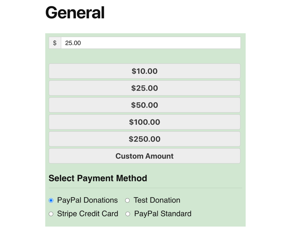
The Visual Form Builder
When utilizing the Visual Form Builder, you gain the capability to incorporate custom styles directly into your forms. To get started, follow these steps:
- Go to Donations > All Forms.
- Click on “Try the New Form Builder.”
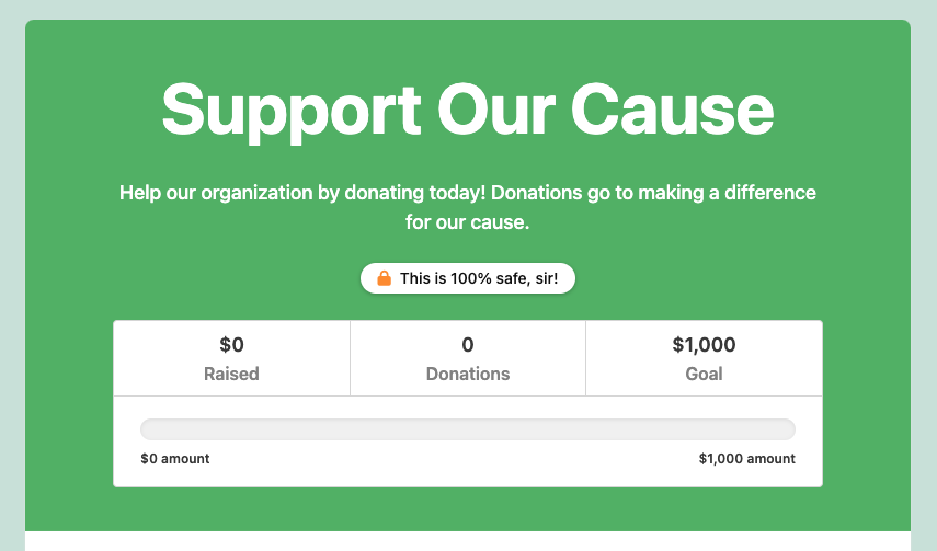
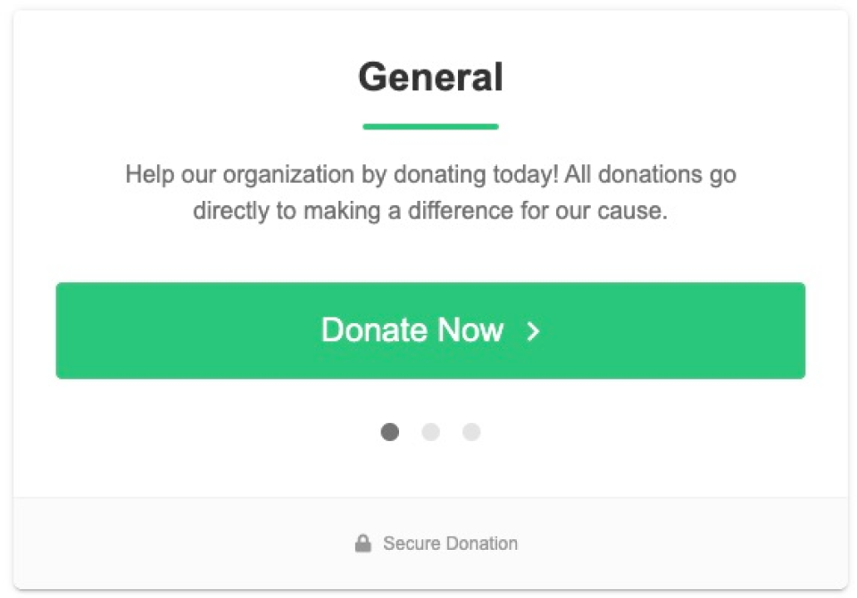
On this page, you’ll find a section labeled “Custom Styles,” where you can insert your custom CSS to style your forms according to your preferences. For instance, if you wish to increase the font size of the form title, you can use the following CSS code:
.givewp-layouts-headerTitle h2 {

  font-size: 4rem;

}
This code will produce the following result:
To further enhance your understanding of identifying GiveWP-specific elements for styling, you can refer to the this section (above). It provides comprehensive information on using developer tools to pinpoint specific elements related to GiveWP that you can customize.
Legacy Template
What this example does: The code snippet below adds a green color to the legacy donation form, makes the donation level buttons wider, and displays the buttons in a single column.
@import url('https://fonts.googleapis.com/css2?family=Space+Grotesk:wght@300&display=swap');

form[class*="give-form"] {
    background-color: #3798353b;
    padding: 10px;
    font-family: 'Space Grotesk', sans-serif;
}

form[class*="give-form"] input#give-amount {
    width: 93%;
    font-family: 'Space Grotesk', sans-serif;
}

form[class*="give-form"] ul#give-donation-level-button-wrap {
    display: inline-flex;
    flex-direction: column;
    width: 100%;
}

form[class*="give-form"] button {
    width: 100%;
}
Multi-Step Template
What this example does: the buttons are wider, the font is changed to Arial, and the donation levels are in a single horizontal row.
The code looks like this:
form[class*="give-form"] ul#give-donation-level-button-wrap {
	grid-template-columns: repeat(5,minmax(0,1fr));
}

form[class*="give-form"] input#give-purchase-button {
	width: 100%;
}

form[class*="give-form"] button.give-btn.advance-btn {
	width: 90%;
}

[class*="give-form"],
form[class*="give-form"] button.give-btn.advance-btn,
form[class*="give-form"] input#give-purchase-button {
	font-family: "Arial";
}
To learn more about how to style iframes, please visit this resource.
Donor Dashboard
What this example does: the information details will be switched from a list position to an inline position, and the stats will be switched from horizontal to vertical.
.give-donor-dashboard-donor-info__details .give-donor-dashboard-donor-info__detail {
    display: inline;
}

.give-donor-dashboard-donor-info__detail:nth-child(3),
.give-donor-dashboard-donor-info__detail:nth-child(4) {
    margin-left: 20px
}

.give-donor-dashboard-dashboard__stats {
    grid-template-columns: repeat(1,1fr);
}
To learn more about how to style iframes, please visit this resource.
Conclusion
Using the tools above combined with the sample code here, you’re well on the way to customizing any aspect of GiveWP. If you get stuck during the process, the GiveWP support team is happy to help you with pointers to help you develop the custom code. Reach out via support channels with the custom code you’re using, and a link to the site, and the team is happy to help get you unstuck.


