How to Use the Visual Form Builder
Creating a donation form is now more intuitive and allows you more control than ever before.
The Visual Donation Form Builder uses Gutenberg architecture to create custom forms by dragging and dropping sections, blocks, and fields where needed.
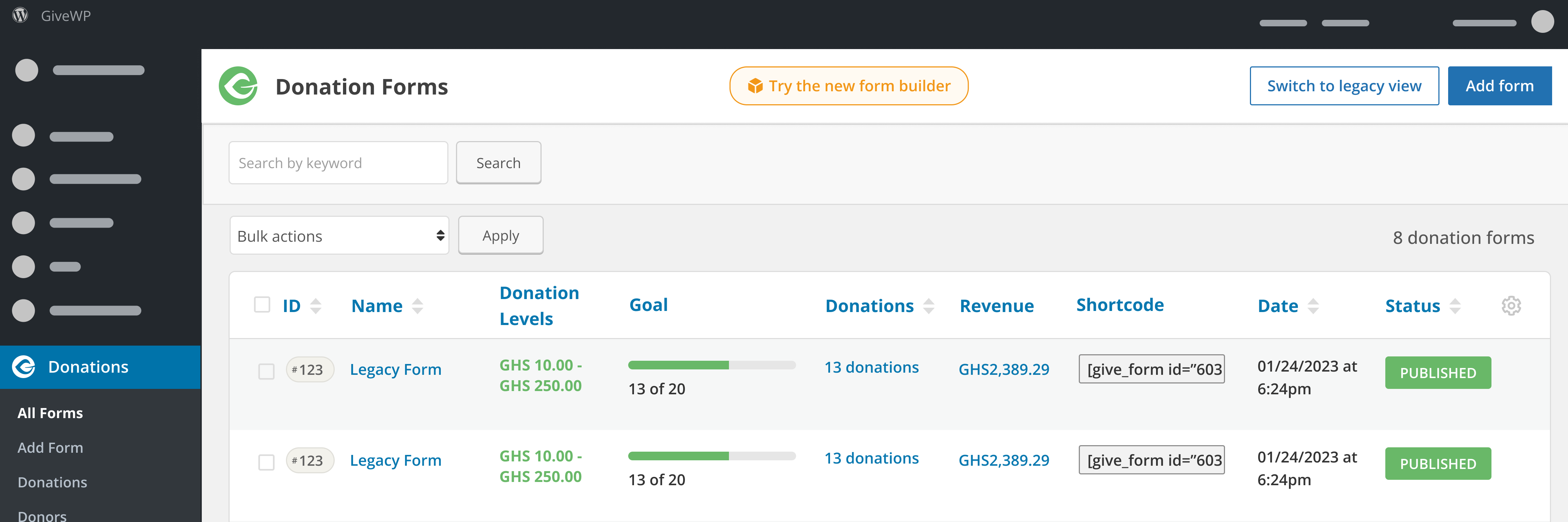
Creating a new form
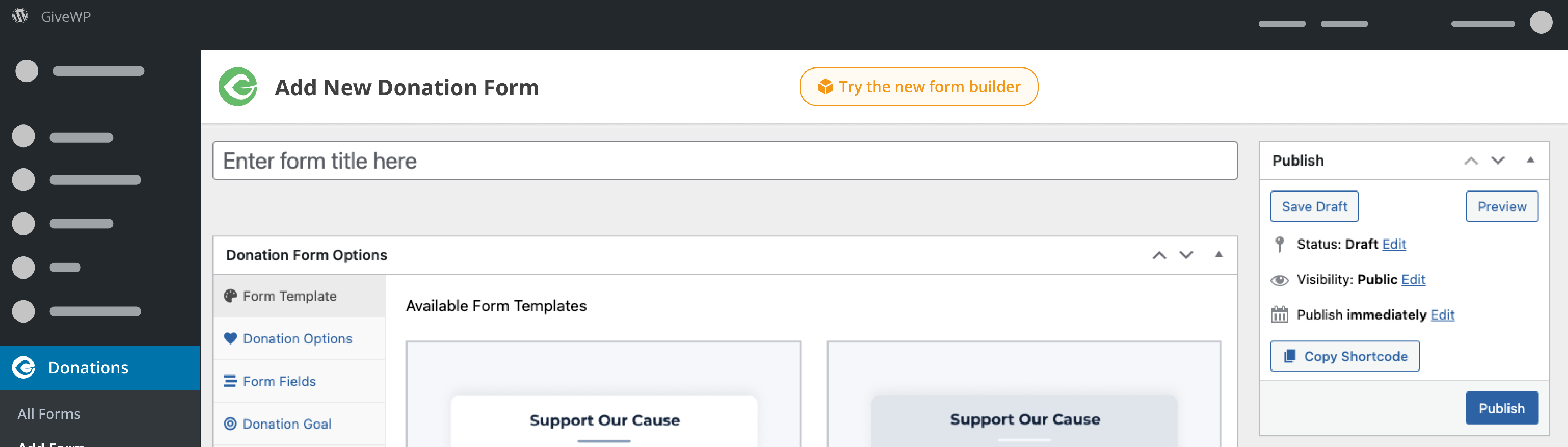
Look for the “Try the new form builder” button in the Donation Forms page (Donations > All Forms) or the current Donation Form editor.
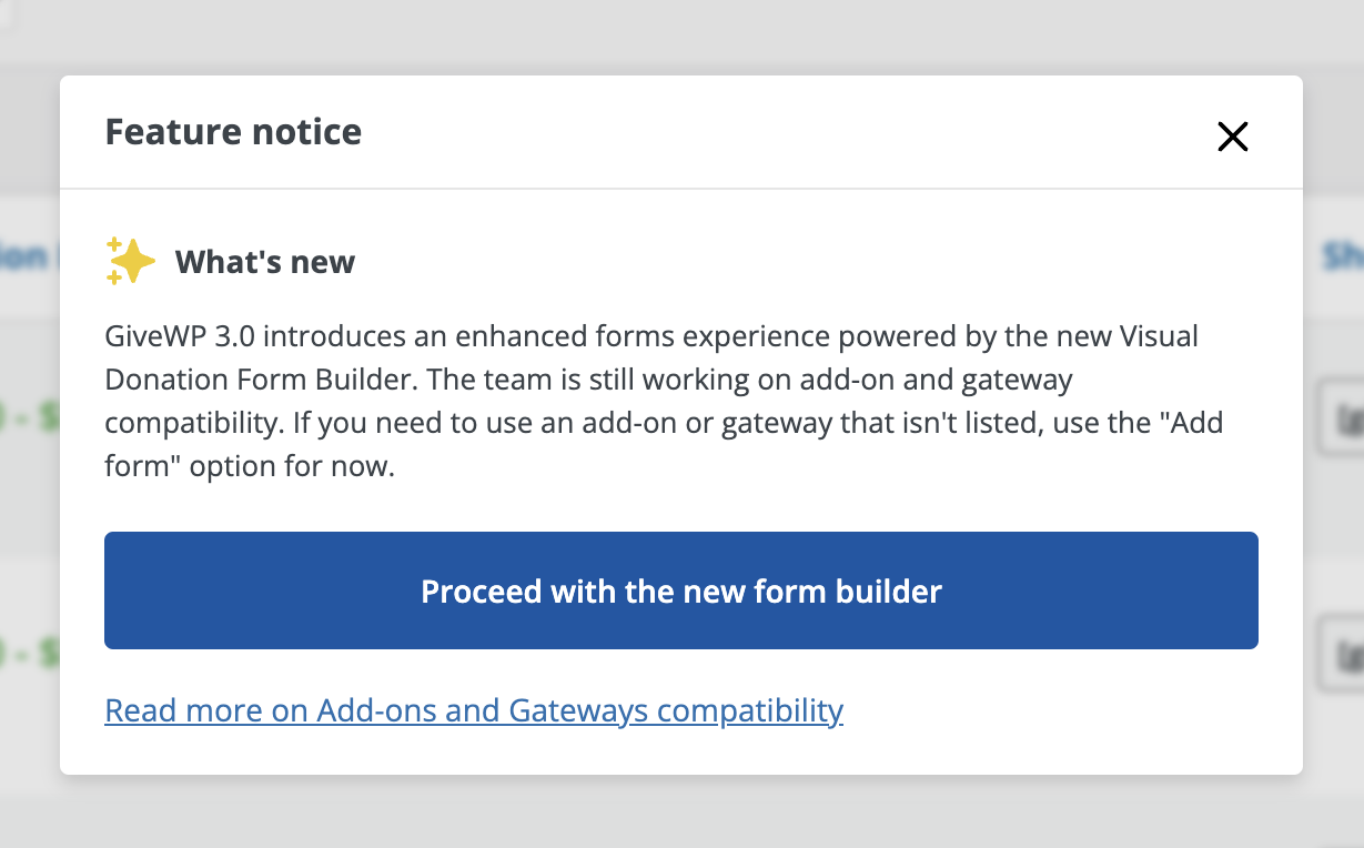
Until full add-on and payment gateway compatibility is achieved, you’ll see a “Feature notice” when you choose to try the new form builder. If you have any active GiveWP add-ons, it’ll let you know which ones are compatible. Choose “Proceed with the new form builder” to start using the Visual Donation Form Builder.
When you proceed, the Visual Form Builder will open in Design, where you can configure your form design settings or switch to editing form fields and other settings.
Designing your form
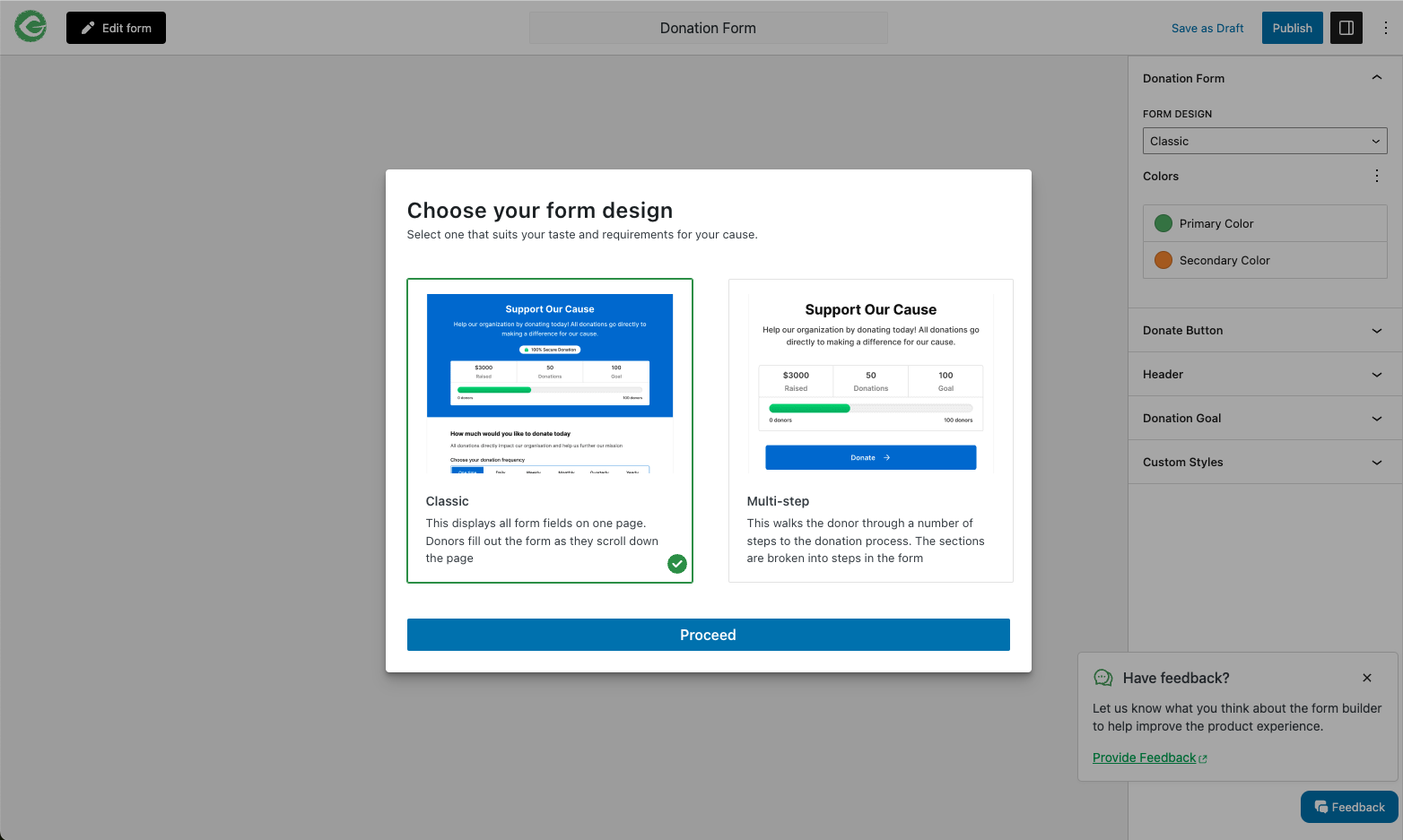
When you create a new form, you’ll be prompted to select a form design.
If this is your first time creating a form in the Visual Form Builder, you’ll get a quick, 2-step tour of the Design editor so you can find what you need. After that, you will not see the tour again unless you choose to view it from the 3-dot menu in the upper right.

In the Design editor, you’ll see a preview of your form in the center canvas. Its appearance will update as you change settings.

The following settings can be managed in the Design editor:
- Form Design: Select a different form design than the one you chose when you created the form.
- Colors: Choose a primary and secondary color for your form. These control the color of different parts of the form, depending on the design you chose.
- Header: Show or hide the header and individual header parts. Change the Heading and Description text.
- Donation Goal: Enable or disable the donation goal, choose the goal type, and change the value.
(Note that if you hide the header, your goal will be hidden on the form even if you have it enabled, as it’s part of the header. You’ll still be able to track your goal in the admin.) - Custom Styles: Add custom CSS to style your form exactly the way you want, beyond the limitations of the provided settings. Learn more about how to style GiveWP donation forms with CSS.
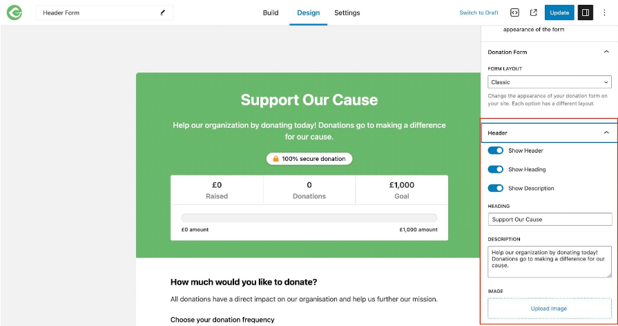
Adding a Heading Image
To add an image to a Visual Donation Form Builder form, navigate to the form at Donations > Donation Forms. On the right-hand side, there’s a section called Header. Select that section to show the options.
Editing form settings and fields
When you’re happy with the way your form looks, you can use the Edit form button in the upper left to access the form settings and block builder.

The first time you enter this editor, you’ll get a quick, 5-step tour that shows you where to access important tools and settings. After that, you won’t see the tour again unless you select it from the 3-dot menu in the upper right.
This editor is where you will manage form-wide settings (Donation Confirmation page, email settings, etc.), sections, blocks, and form fields.

Form Settings
Form settings are settings related to the entire form you have created. These settings affect how your form functions and is presented, as well as the form page.

On this tab, you can manage the following settings:
- Summary: Change the title and form URL.
- Donate Button: Change the text of the donate button.
- Donation Goal: Enable or disabled the goal and adjust the goal value.
- User Registration: Enable email notifications sent to the admin when you have a new donor.
- Donation Confirmation: Write a custom message for the Donation Confirmation page to thank your donors or give them additional information.
- Form Grid: Change the redirect URL and the donate button text for your form when it’s shown in a form grid.
(Tip: You can also change the form title at the top of the page, whether you’re editing the form design or the settings & fields.) - Email Settings: Customize email messages for New Donations, Donation Receipts, and more.
Block Settings
A block is a form field, group of related form fields, or other content that you can add to sections on your form. Block settings are the settings that belong to a specific block inside the form. Settings for a block may include title and description settings, field labels, field placeholders, etc. Each block has its own settings.
The Donation Amount and Levels block, for example, contains block settings that include the field label, multi-level or fixed donation options, minimum and maximum custom donation limits, donation levels, and (if you use the Recurring Donations add-on) recurring donation settings.

Form Sections and Content
A section is a group of blocks (form fields and other content) on your form. Each section of your form has a title and description that you can edit.

You can add as many sections to your form as you want by dragging them into the form from the Layout section of the blocks menu.

Deleting a section
When you want to delete a section, you can do so by selecting the section and choosing the Delete option from the 3-dot menu in the section tools.

You can also delete a section from the list view on the left side of the editor.

Adding more content
Additionally, you can add paragraph blocks to your sections to add more text content. You can add as many paragraph blocks as you want to any section of your form by either dragging them from the blocks menu on the left side of the editor or by using the plus symbol at the bottom of a section.
You can also add more form fields, but there are restrictions for certain fields.
Adding Form Fields
One of the simplest ways to customize your donation form is by adding form field blocks. To add a new field, click on the plus sign on a section and add a new block. Or, you can drag a new field in from the blocks menu on the left side of the editor.

Restrictions for adding form fields
These fields correspond to important donor or donation information that can only have one instance on your form. If they are already on your form, they will appear inactive in your blocks menu, and you cannot add them again.
- Donor Name
- Payment Gateways
- Donation Summary
- Donation Amount and Levels
Removing Form Fields
Just as you can add new form fields, you can also remove them. You can remove any field from your form by selecting the field block inside your form and choosing the Delete option from the 3-dot menu that appears in the block tools.

Restrictions for removing form fields
While you can remove any form field, some are required for the form to function. If you remove these fields, you will get a warning when you try to publish telling you to re-add them. The form cannot be published until you do.
- Donor Name
- Payment Gateways
- Donation Summary
- Donation Amount and Levels
Publishing your form
When you’re finished editing your form, and you want to publish it to your website, you can use the Publish button in the upper right of the editor. Alternatively, you can Save as Draft and come back to finish it later.


